Mood Boards and Why They are Important
I have always relied on mood boards when starting into a design phase for a product or pattern. Mood boards are a great reference point for starting your designs. They enable you to visually communicate your ideas and allow you to assemble all your inspiration in one place. There are no hard and fast rules for putting together mood boards, but they should communicate your theme, your choice of colors, and possibly your design and motif direction.
If you are working for a client, a mood board can help them to get a sense of your design direction so you can ensure you are on the right track. It saves time at this beginning stage. If you're not on track, you won’t have spent a ton of time developing ideas they are not interested in.
For those who set their own briefs, which is most often the case with me, mood boards help me formulate a clear direction as a starting point for creating my designs. My agent will send a list of “needs” like “Mardi Gras” or “Garden Friends”, and I have to do all the rest.
 These are the kind of things I consider for most mood boards:
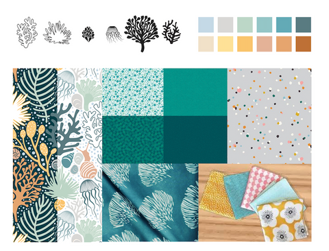
Colours
Your mood board should show a strong sense of the colour palette you intend to use. This could be shown through just the images you choose, or you could include colour chips also.
Inspirational Image
They could be photos that you've taken, magazine images or images from books, or images you have on a Pinterest Board (usually my go-to).
Motifs
You could include images or reference material that show what sort of motifs, design ideas and themes you will be using for example, if it's a floral design, I would have several angles of a particular flower. I often have a notebook in which I even start quick sketches which I might photograph and add to my mood board.
What to consider when creating your mood board:
Theme is the most important
My theme, colour and motif direction should be crystal clear. Anyone looking at my mood board should have a good sense of the direction I am going with my design. I don’t want to be confused or torn when I am looking at it. I only want to include items that will support my theme. I create my mood board in Photoshop or Procreate, either of which allows me to import images and place them in a nice arrangement. My mood board serves as a reference point throughout my design process and I tend to refer to it regularly to make sure I am on track.
Arrangement
When I am setting up my mood boards, I consider not only the images I am displaying on my mood board, but also the background space. I try not to have it too crowded so that I can see all the images clearly. I take a lot of time to consider the content and you can see from the examples that the mood board, in itself, strikes a mood or direction. The design of the board continues to inspire me throughout the design process.
Focus of Attention
Having a focal point on my mood board is something I try to do. This can be achieved through image size or colour. It's ideal if the eye can initially focus on one element (this is usually my main direction) and then meanders around the board. This is especially important for a board you will be presenting.
Balance and Unity
I like to be sure all elements on my mood board are balanced. I will consider how colour, shape and size all work together. I try to answer all the questions I have for myself about the design I am working on. Do I want it dark and moody or light and breezy? Do I want the design busy or minimal? I collect as many references as I need to get me going in the right direction.
Now try your hand at creating one for yourself. What is your next project? If you would like to watch a class in which I talk more about this whole process, check out this one:
The class features Adobe Illustrator, but the theoretical knowledge you will pick up about the design process is all relelvant. Enjoy!

Your blog is wonderful, Delores! So much great information here!